This new fabulous meme is brought to us by Melissa at i swim for oceans.
Question: What books have better covers than content, and what books have better content than covers?
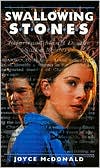
I absolutely love Swalling Stones by Joyce McDonald. But the cover... Sure, the book was published in 1999, but the cover is still horribly outdated, and I think that's what makes people overlook it. I've referred it to people again and again, but the cover always makes them hesitate to pick it up.
Seriously, it's a good read!
Another one published in 1999, and another unfortunate cover. Blood and Chocolate by Annette Curtis Klause is an awesome book. And an equally awesome movie (albeit very different from the book itself). I think most readers jumped on board after seeing the movie, because this cover isn't attracting anyone. It's dull, and doesn't appear to match the title in any way.
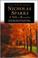
Look at that cover - gorgeous! Autumn in all its fading green and orange glory. A serene, tree-lined path. And yet.... A Walk to Remember by Nicholas Sparks falls beyond flat. This is one of those rare times when the movie is actually better than the book. Tragic, right?
But the descriptions go on for pages and they're unimportant, and the story itself moves dreadfully slowly and comes off boring.
Oh, but that pretty cover...
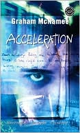
Here we've got another awesome read: Acceleration by Graham McNamee. No, really. This is another awesome book. But you definitely wouldn't think so by the cover. And get this - it was published in 2005. 2005! And it looks that outdated.
I like the blues and the hint of purple, but the face and lame font need to go.
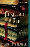
Love the book stack. Love the darkness. Love the font.
The story? Not so much. The Thirteenth Tale by Diane Setterfield has such a slow pace, and takes forever to get into the actual story. Hate to say it, but I couldn't even finish this one.
I know, I know. Meg Cabot? A bad read? Unfortunately, yes. I've been a fan of hers for years. But this was the end of the line for me.
Airhead's cover is flashy and glitzy and shiny - 3 things that I love and catch my eye. But the story, the writing, everything... none of it worked for me. This was another that I couldn't finish.
The cover may have lured me in, but I didn't take the bait.



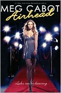
I dunno why but Meg Cabot's recent works have left me far from impressed. But this Airhead series was so beyond bad, it was sort of embarrassing. =\ And I can't read Nicholas Sparks. I don't deny that he has some good books but I'm allergic to mushiness. I always want to unleash a vampire in his stories just to see what happens. Haha.
ReplyDeleteI'm so with you on Airhead by Meg Cabot! I love her work...she's truly genius...but that cover was just far better than the writing. Blood and Chocolate is another perfect example - horrible cover, but amazing, amazing book!
ReplyDeleteThanks so much for participating, Alissa!
Nafiza - Honestly, I can't stand the mushiness either. But I thought the movie was good and wanted to read the book. Never again, though.
ReplyDeleteMelissa - No problem, love the meme! :]
What a great idea!
ReplyDeleteI can't read Sparks but I love his movies. I think it's the same as with Austen -- I love the IDEA of the story and such, but the actual reading of the book? Notsomuch. :D
Haha!! Very cool post. I love all the stars on your layout.
ReplyDeleteTotally agree with you on the Meg Cabot! Sheesh..and I've never read a Nicholas Sparks book before, but if I did, I would've picked up A walk to remember just because the cover was so nice!! aaah!
I'm your newest follower :)
xo,
Lah @ Lazy Girl Reads
I'm so sorry you cant enjoy The Thirteenth Tale as I do.
ReplyDelete